TotallyMoney: Making credit score changes make sense
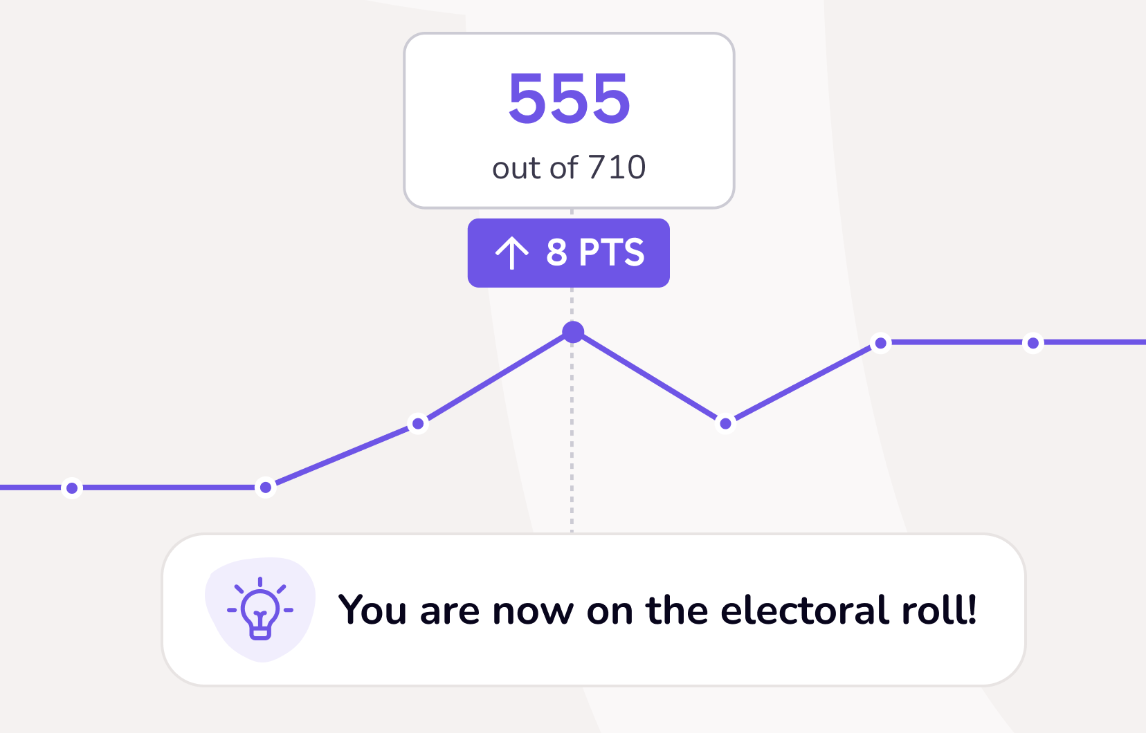
How I redesigned 47 reason codes, to help customers understand why their credit score changes.
Timeline: Early 2023
Platform: Mobile, Android and iOS
My role: Sole content designer
What I owned: 47 'reason codes', redesigned from scratch and approved through credit report provider
Aim: To clearly communicate the reasons a user's credit score changes, in a clear, accessible way
Outcome: Measurable reduction in customer queries to operations team on the subject of score changes, tracked post-launch
Credit scores are complicated. They're an algorithmic representation of the contents of your credit report, but knowing how that algorithm works and what causes the score to go up or down is very unclear to the general public.
Naturally, we wanted to fix this, to show customers when their score changed, and why. By showing the exact reason it changed, we could help users understand why it changed, so they could improve it in the future.
This would clearly involve a lot of explanatory UX copy. It would have to explain complex topics simply and clearly, in a limited amount of characters and space on a mobile screen.
What we were dealing with
This is what the existing 'score history' feature looked like in the TotallyMoney app.
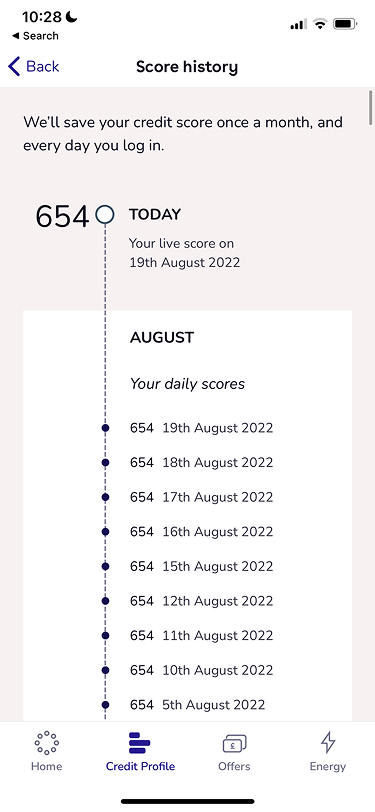
It only really showed a literal history of the user's score, captured whenever the user logged in, or when the TotallyMoney service pulls the score. No reasons why or visual representation, or even if it went up or down. Just a list of scores and dates.
This clearly was not serving user needs, as customers had no way of knowing why their score changed.
Explanatory UX copy
It quickly emerged that a large part of this project would entail rewriting the 'reason code' copy that TransUnion (TU), the credit report provider TotallyMoney partners with, uses in the API for this feature.
When a user's score changes, TU is able to find the reason - usually - and the change gets a code with a reason attached. This might be related to credit usage, the electoral register, new accounts, or (un)missed payments.
Whatever the reason, TU had some copy that, for TotallyMoney's purposes, needed rewriting.
The rewritten reason codes would be lighter in tone and voice, simple to understand, and accessible. They'd either congratulate the user for positive score movements, or be in a supportive voice if their score had decreased.
I decided, along with the rest of the team working on this project, that they'd also be shorter and less wordy than TU's versions. We only had limited space on screen and we knew from both our own research and wider public research that app users only tend to read the first few words of a sentence, or glance at it. Each of the 47 reason codes needed to be simple, engaging, and accessible.
Rewriting the reasons
It was clear from the start of this project that there would have to be some overarching guidelines and standards, to govern the 47 reason codes and make them consistent with each other.
I decided that in general, the positive score changes would have a light celebratory tone. The negative score changes, on the other hand, would be supportive and motivational.
However, as TotallyMoney is not allowed by regulation to give advice, the reasons would have to stay factual and give information only, at all times.
I also decided to try and limit the length to 3 lines if possible, as designed in Figma, for all the reasons.
Your score has improved because the percentage utilisation of your revolving credit has decreased.
The above was TU's original copy for one of the reason codes, for a positive score change due to credit usage. Verbose and very inaccessible.
You used less of your available credit than in previous months. Well done!
Another one:
Your score has improved because the number of months since any of your accounts have been 2+ months in arrears has increased.
For customers whose financial literacy may be low, this might not be understandable at all.
Part of the issue was the repetition of 'months', which introduced two time periods and just made the whole thing confusing.
Another one of my overriding guidelines for the whole project was to have only one timeframe in each rewritten reason code. This decision greatly improved the clarity and made the reasons immediately easier to digest and understand.
You've been keeping your payments on track recently. Great job!
It could be argued some of the detail has been removed here, specifically in relation to the '2+ months' part. But I would argue the customer may not be interested in that; the part they care about is whether they've been keeping up with payments, and the fact it's improved their score.
And besides, the UI card in the app feature is clickable and takes them through to a screen where they can see a visual representation of their missed payment history. Adding more detail in here would have just made it too busy and hard to understand.
And now a 'negative' one, where a user's score has decreased:
Your score has worsened because you have opened new accounts in the last 24 months. Opening new accounts indicates an appetite for credit and this may increase the risk of missing payments.
While this is largely understandable, it's not supportive or engaging at all. This kind of message may turn the user off from using the app altogether.
So I rewrote it with my guidelines in mind:
In the past two years, you opened a new credit account. Opening too many too frequently can have a negative impact on your score.
The electoral register also contributes to score changes. The TU copy for this negative change was also particularly verbose:
TU version
Your score has worsened because the length of time on the Electoral Roll at your current address is less than that recorded 3 months ago.
So I rewrote it to be clearer and simpler:
My rewrite
Being on the electoral register at your current address for less than 6 months can have a temporary negative impact on your score.
While still quite long, the message in my rewritten copy is more understandable and accessible, especially when reading at a glance. It's also more supportive, as the word 'temporary' is doing a lot of work, which TU had not included.
Working within the API constraints
Each of the rewritten 47 reason codes needed approval from TU, which threw up some interesting challenges.
Generally speaking, their feedback fell into a few consistent themes. In a few places, terminology needed to be more consistent, for example 'county court judgment' becoming just 'judgment' to cover other types of legal record.
In a handful of cases, TU corrected TotallyMoney's collective interpretation of what a specific code was actually measuring. This meant in those cases, I needed to rewrite the copy from scratch around a different premise.
There were also some occasions where the content I'd written strayed into financial advice territory. As TotallyMoney cannot give financial advice by regulation, this needed fixing before the feature went live to customers. I corrected these instances to simply give the facts, rather than telling a customer, or even implying, which actions to take.
Finally, TU occasionally pushed for more explanatory detail than I had originally included. Adding more information made the content longer than I had intended, so in many of these cases I pushed back against TU's feedback, or found a compromise.
In each instance here, negotiation was required. I had to balance TU's requirements against my own guidelines and boundaries, to keep the content short, accessible and compliant with TotallyMoney's own legal team, who were involved in the process throughout.
Responding to customer feedback
When the feature went live, it quickly became a key feature in the TotallyMoney app. It served user needs - why has my score changed? - and was well designed, both the visual product side and the written side. It significantly reduced customer support queries, because instead of needing to ask why their score had changed, they could see directly in the app.
Paul Ursu, Trustpilot
Lockmonstors, iOS App Store
However, not all the feedback we received was positive.
Specifically, one reason code, around credit usage, was causing issues. Multiple customers were getting in touch because the copy we were using, approved by TU, implied they were getting close to their total credit limit, when in fact they weren't.
While this was technically true, what I'd neglected to mention was this change actually took place 6 months prior. So, while their credit usage may have increased 6 months ago, it affected the score 6 months later, making customers think their usage was increasing when we told them, and not 6 months ago.
I used multiple bits of customer feedback, plus spoke with TU, to figure out how to reword this to be more understandable, while still within TU's API constraints.
That ended up with the wording going from:
You’re getting close to your overall credit limit. Using too much credit can have a negative impact on your score.
To:
Six months ago, your credit usage, excluding any mortgages, increased. This higher usage has had a negative impact on your score.
The outcome
Since launch in Q2 2023, hundreds of thousands of customers have used score history to find out why their score goes up or down. It is also a significant driver to have customers download the app, as it is a mobile app exclusive.
Below is a visual representation of the feature, with the timeline/graph and the reason codes below it for each score change.
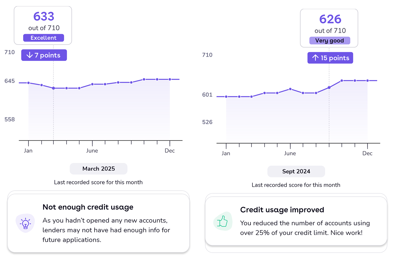
There are times when TU cannot find a reason for a score change, typically if the change is less than 5 points. In these instances we display a message relaying this to the user.
What I learned and what I'd improve
As I was given fairly rigid existing content, it was sometimes difficult to get the meaning of the original TU copy across, while hitting the right tone and level of detail to meet the overall feature's aims.
If I was doing this project again with the knowledge I have now, I'd come at it from a slightly different angle of storytelling for the user's score.
Rather than treating each reason code in isolation, I'd have framed them as a narrative. This would begin with where the user's score started, the journey that shaped it, and where it stands now.
This approach would make the score history more personal for each user, better fulfilling the user need of helping them intimately understand the reasoning behind their score changes.
TotallyMoney's tone has also changed a bit since this project, so I'd refresh the copy accordingly. Over time it has become more supportive and helpful, so especially for the negative score changes, I would aim to reflect that more, encouraging the user that small dips to credit scores are perfectly normal.
Thanks for reading.